The Photobook
Photo books are created by photographers whether they are well-known or small to show a variety of their work. This is the medium on which artists are now judged. Most photographers believe that books are the perfect way of getting work out in a cohesive way, recently more art institutions are including books within the shows or even devoted entire shows towards to the books. This is a new way of looking at some photography as its made in a print form most people would only see the images digitally, if books are published its much more likely people will interact with the image as they are less likely to go to an exhibition of a smaller photographer. Using a photo book brings a new quality to photography and it encourages photographers to look at their work in a different way as they are thinking about the relationship between the images and how they would look together. It also gives photographers the chance to incorporate text and tell a story with both imagery and text. Using books also changes the experience for the people buying and looking at the work it makes the work potentially more personal and makes someone feel more connected if they have a personal copy, it also gives them a sense of ownership although it may not be an original copy the book would be there's, it would make them feel more connected with the images and the artist.
explore the history of the photobook and its role as a crucial vehicle for the sharing of photographic images
explore the history of the photobook and its role as a crucial vehicle for the sharing of photographic images
- investigate great examples of the photobook form, comparing and contrasting the ways in which a range of photographers have exploited its affordances
- experiment with the creation of their own photobooks
Two-Frame Film
Luke Fowler
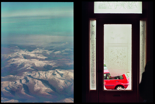
In this image by Luke Fowler there's clearly conflicting image being shown to us its the natural mountains and then the broken window and car. The vibrant red of the car really contrasts from the muted blue tones of the mountains and the sky, I think these two images were put together because they are both similar in that they are very simplistic images with a hint of colour throughout them. There's also a light that goes through the middle of both images and a darkness that surrounds the edges of the image which helps to bring them together. These images both have quite a lot of negative space within which helps add more depth. However, these images are also quite different because they have different perspectives one is shot from the inside looking at the broken window and the other is shot from the outside looking at the outside world. There's no obvious links between these two images which makes it difficult to understand why the photographer may have put them together.
|
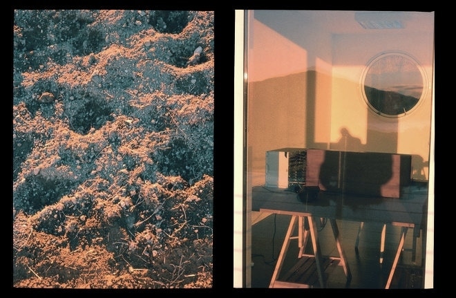
This is another image made by Luke Fowler this image is clearly more related then his other image. This image has a similar colour theme throughout it of the burnt oranges and dark blues/blacks. However, the actual images themselves are actually really different from one another the one on the left is of nature and the one on the right is within a house. Much like some of his other images they don't relate in subject but are similar in colour. Within the one on the left its very natural whereas the one on the right is a modern looking home with the minimalist furniture, these images are highly contrasting and there's no clear links between the two other than the colour scheme.
|
|


These are some more of Luke Fowlers images, some these images have more of a relation to one another than some of his other two frame films. Luke Fowler is also filmmaker and during a stay in Germany he borrowed an Olympus Pen F and took these half frame images, after developing the film he was amazed by how much chance there was in creating these diptychs he then decided to start a new project. This book shows the line between film and photography, a lot of his images look like they are very similar to film stills. Fowler believes that 'in the blink of eye' has different meanings for the camera and the human eye as we blink and go blind to the world for a second the camera can capture everything in that second. Some of his images were taken moments apart but others may have been taken at different times.
Two frame film
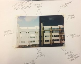
These images are another two-frame film piece, these images were clearly taken seconds apart of the same building. In the first image you can clearly see that it was slightly overexposed too much light was let in by the lens and then in the second image the right amount was let in and the image came out much clearer and more detailed. Both of these images also have clear light through the central and are slightly darker around the edges.
Edward Ruscha- TwentySix Gasoline StationsEd Ruscha explains that within all of his books he just wants to 'explore the subject dead-head, straight-on, without much emotion' , Ruscha's books have very deadpan subjects like his other books LA's swimming pools and parking lots. The cover of the book relates closely to what the book represents, its a very dull cover with a slight colour it follows the theme of the book quite dull and uninteresting. I don't think that the cover of the book is very intriguing it doesn't attract attention the only thing that might catch people's eye is the red text on the front. The photography within the book is very simplistic what makes it more interesting is that although all the images are taken at similar angles the images are all different from each other, taken in different places at different times of the day, the images aren't all the best images some are out of focus and slightly grainy. Throughout the book there is a clear vision, he takes images in the same way with the same camera I think the way his images are taken suit the subject matter, he's images all have a stillness to them they have the feel of a place long abandoned by people. Throughout the book the layout is quite diverse some of the images are placed on one side with a caption on the other side, some images are placed across a double page spread with the caption underneath them and some have two images placed on one page with captions on the other side. I think that the page layout is carefully thought out he planned very carefully where he wanted images to be placed. The text throughout the book is quite small and doesn't give a lot of information about the images it tells us the name of the gas station and where its located, all of the text has the same font and colouring apart from the font used on the cover of the book. Overall I find this book really interesting i like the layout and the images in the book its different because it has quite a dull subject matter the layout makes the book interesting.
|
|
Wolfgang Tillmans
|
|
Wolfgang Tillmans book focuses mainly on fashion photography but also within this book he includes portraits of his friends. Throughout his book he uses diverse ways of layout the book he has some images across a full page whilst others he has two contrasting images next to one another then he has a few pages were he has many images all on one page together that are all the same size. I think the arrangement of the images was carefully planned out some of the images contrast each other whilst others are quite similar to one another, the size of the images also seem to play into the arrangement of the images but also the amount of people within the images. On the cover of the book he uses an image that is very different the pose of the people is very unusual that we see later in the book he doesn't crop the image or edit it in anyway the title is printed right across the middle of cover, I think the front cover is very effective it represents the book.The clothing that they are wearing on the cover of the book is very simple with the woman wearing a simple white dress then conrtasting with the man who has slightly more colour and writing on his skirt. This book appeals to me because the photography is quite simple but Wolfgang Tillmans uses people and light in a intriguing way some images have a lot more light and people making it interesting to look at. Overall I think this book is really interesting its a book that you want to look at again and try to understand the images better and you want to try and notice everything about an image like the way the people are posed and how they are dressed.
|
Viviane Sassen Flamboya
|
Viviane Sassen Flamboya, this book includes many images taken from across Africa. Most of her images are portraits of people with their faces obscured using light or some object, but the book is based on fashion photography. Viviane Sassen uses light in her photography in a way that shows strong lines, shapes and shadows. The book has different page layouts she decided to place images over a double page to show the background of the image, some she has next to a blank page so that the image is what the viewer focusses on. The layout helps the viewer focus on certain images it shows the images in a clear way that makes them stand out and makes a viewer see them in another way. The layout feels very carefully planned out, its been clearly thought out and sequenced in a specific way. The cover of the book has a very intriguing image and it has quite a lot of negative space within it, she decided to place the text in the top right hand corner, the text is white and it is almost blending in within the background of the image. The photography throughout the book is very strong all of her images are carefully framed and lighting is used in an effective way to show the key parts of the images. I really enjoyed looking at this book I think its very memorable it has many elements like line, shadow, tone, texture, colour and shapes that help the viewer remember the book.
|
|
Bernhard Fuchs- Roads and Paths
|
|
Bernhard Fuchs book is very simple all of the images within the book are simple images of roads and paths, the layout of his book is also simplistic his images are all placed on their own pages so that the viewer is able to focus on the image. The front cover of the book is one of the images with no title on the front, this is quite effective because it makes the person wonder what the book is about. All of the photography within the book is well framed also throughout his book he uses colour and black and white showing the different seasons, but it also shows different tones and textures. Throughout his whole book he includes no text, even on the front cover his whole book doesn't show a narrative. The page layout doesn't change throughout he has all of his images placed on one page whilst there's negative space on the other side, this makes the book less interesting to look at because its simple layout and simple images make it dull. I feel like the layout of the book was clearly planned but it makes the book look very dull it should have a more interesting layout. Overall I don't like this book I feel like the dull subject matter doesn't match the quality of the images its also not a memorable book.
|
Josef Sudek Praha Panoramaticka
|
Josef Sudek's book is focused on panorama's in the city of Prague, the front cover of this book isn't very interesting the image is quite dull, there isn't much to look at the text is placed around the image and its printed in another colour making it stand out slightly more but overall I think that the cover of the book isn't very effective.This book is a collection of panoramic images which makes it stand out from other books because the images are different panorama images are not typically used within photobooks, I think throughout the book there was a clear vision of what Josef Sudek wanted to show. I think his landscape photography is paired really well with using the style of panoramic images, it suits the images being taken. The photographs look sophisticated they are carefully framed, well thought out and the lighting used was all natural making the images look better. The layout throughout the book is very simple every image has a double page spread and the images have quite a lot of negative space around the outside of them making them easier to focus on as most of the images have a black border around them, I think the pages have been clearly thought out he clearly wanted to show each image individually. The overall layout of the whole book feels slightly outdated he could have used different types of layouts throughout having some images put together to create diptychs and some images just across one page having more negative space around it. I think that this book isn't very memorable its an interesting book but the images are quite dull and the layout isn't interesting as they are all set out in the same way.
|
|
The Art of Instruction
The Art of Instruction is how you interpret and create work based on someone else's instructions. The art of instruction is about the decisions you make as an artist based on a instruction to get a successful outcome.
The 'Do it' books started with Hans Ulrich Obrist. 'Do it' started over 20 years ago and now has over 60 incarnations as exhibitions, archive, videos and seminars.
The 'Do it' books started with Hans Ulrich Obrist. 'Do it' started over 20 years ago and now has over 60 incarnations as exhibitions, archive, videos and seminars.
Erwin Wurm


Erwin Wurm created instruction drawings and used text to present an instruction using an object near by, he created these for visitor's of the galleries to 'perform'. Sometimes he would photograph the actions being 'performed' himself other times the performers would take the images themselves. The improvised nature is very similar to the work of the 'Do it' book and exhibitions were artists create instructions for people visiting galleries to perform. His book 'One Minute Sculptures' was made in the late 1990's, the instructions within it turn people into the artwork so instead of seeing the artwork they become it for a short period of time. All of Erwin Wurm's images are very different his images are not taken at a normal angle or even always in focus which shows the thought process, it shows that its very quick and its not being thought about at the time similarly to how these strangers put themselves in his exhibition.
Sol LeWitt


Sol LeWitt created instructions that are quite different from Erwin Wurm's he uses words to describe what he wanted the person to do. His instructions are more detailed and can't be interpreted in many ways it leaves the performer doing exactly what LeWitt wants them too.
Responses


Within this task we were given an instruction and we had to take images based on the instruction. This was inspired by Erwin Wurm's one minute sculptures and the do it exhibitions these are exhibitions with objects and instructions created by artists for people who go the exhibitions they can perform and document the instruction. Our instruction was to hold an exercise above our head whilst standing on one leg, we had to create images that looked like sculptures.
My Instruction
Go to place you've never been and take as many pictures as you like.
Within this task we were given an instruction and we had to take images based on the instruction. This was inspired by Erwin Wurm's one minute sculptures and the do it exhibitions these are exhibitions with objects and instructions created by artists for people who go the exhibitions they can perform and document the instruction. Our instruction was to hold an exercise above our head whilst standing on one leg, we had to create images that looked like sculptures.


100 Photographs


Within my images theres strong geometric shapes, lines, spaces, abandoned places and a sense of stillness.
How to make books
There are many ways to make a book you could have a handmade book, a zine or a printed book. One example of a bookbinding is Japanese 4-Hole book, section sewn and pamphlet binding. A handmade book would give it a more intimate feel it makes it more personal the person viewing the book may feel more connected to it compared to something like a published book. Another way to make a book would be a zine, zines are more experimental they can have anything within them because of how they're made and what they look like some are more serious like photo books and some are more like fanzines.
Photobook 1


My first photo book has a simple binding technique I decided to bind my book in this way to make it simple. The quality of my images doesn't look good throughout the book they look out of focus and blurred every image was the same size meaning that there was no variation of images. I also didn't have varied layouts throughout the book I kept the layout the same except a couple of pages that I decided to move some of the images around a little bit but I didn't have double page spreads or single images on pages by themselves.
Photobook 2


The second book I made I chose a different set of images. The images that I decided to use were different from my first book these images were more interesting they had better shapes and lines. A few of these images had a lot more space within them, throughout this book the quality of the images is better. Also within this book I created some more interesting diptychs and I decided to vary the page layouts more to make the book more interesting.
Final Book
For my final book I decided to get it printed off using Blurb, I decided to get a portrait book. For my book I found it easy to decide on the cover image because the image is quite eye-catching I thought it might attract attention and get people looking at the book. Throughout the book I decided on using most of the images I used for my second maquette because the images were all simple but effective. They all convey a sense of space and strong lines throughout them that I feel like connects the images to one another.
